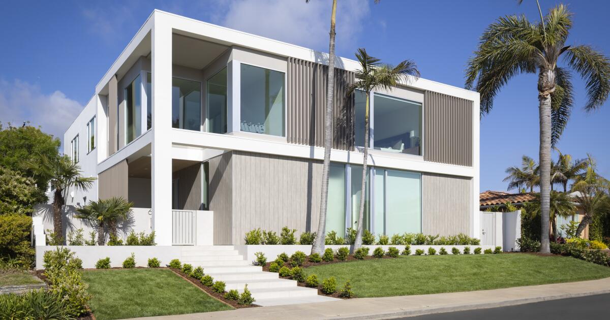
Sometimes the old adage “you can’t go home again” is simply untrue. At least, it has been for Jeff Holman. The former investment banker, now adjunct professor at UC San Diego, was raised in East County before moving to New York City and then the Bay Area. In that time, he married his wife, Patricia, a partner with Deloitte, and they had three kids, the oldest now 17.
In 2019, the investment fund he had been running closed down and the couple realized that they could live anywhere. Ten years earlier, while still living in Manhattan, they had bought a 1,900-square-foot house in Windansea and decided it was a good time to return to San Diego to live there.
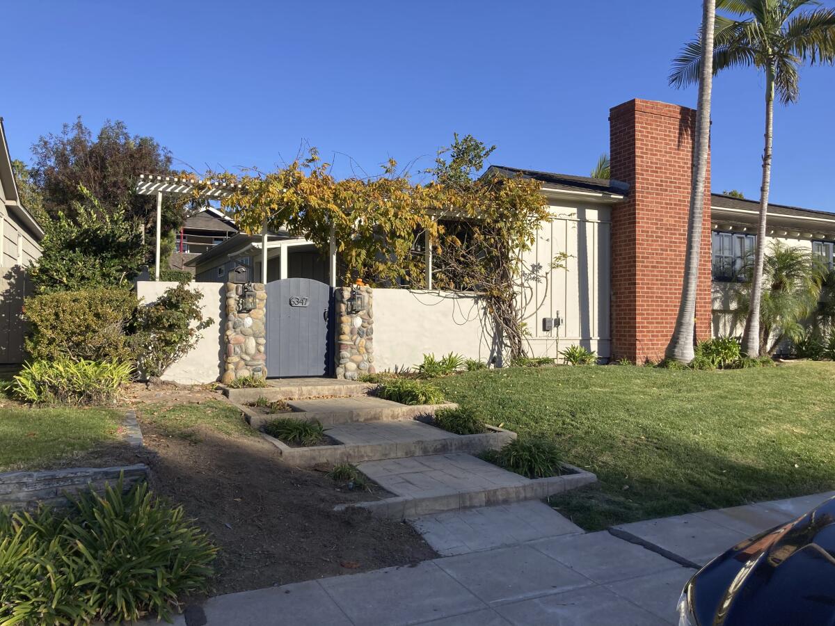
The original brick-and-wood, ranch-style home was built in the 1950s, like many in the neighborhood, and encompassed 1,900 square feet.
(Christian Rice)
Like other houses in the neighborhood, the one the Holmans purchased was a 1950s-era ranch-style home.
“We were told by a neighbor that it was a modular home — she remembers being a little girl marveling at the house being brought in on a truck! Some of the cinder block foundation seems to support this idea,” Holman explained, “but as a result the house was not built to the same standards as some of the contemporary homes in the neighborhood by architect Thomas Shepherd.”
It was also much smaller than what they were used to.
“We love the area; there’s family in town,” he said. “But we’d gone from 4,000 square feet in the Bay Area to less than half that here.”
Once the couple decided the house needed to expand for their family of five, they found architect Christian Rice through a local builder, who said Rice’s designs and plans were always thoughtful and comprehensive and had an aesthetic that matched theirs.
“We love certain aspects of midcentury architecture — long lines, expansive windows — and wanted to create something that, while being modern, would incorporate elements from when the neighborhood was established,” Holman said. “We found an inspiration home online in the Hamptons, not too far from where we summered when we lived in Manhattan. That house incorporated many of the vertical louvers and reeding elements that permeated our design. We liked how those elements soften the starkness of a modern box without adding additional ornamental structures.”
Holman explained that he and Patricia wanted four key things:
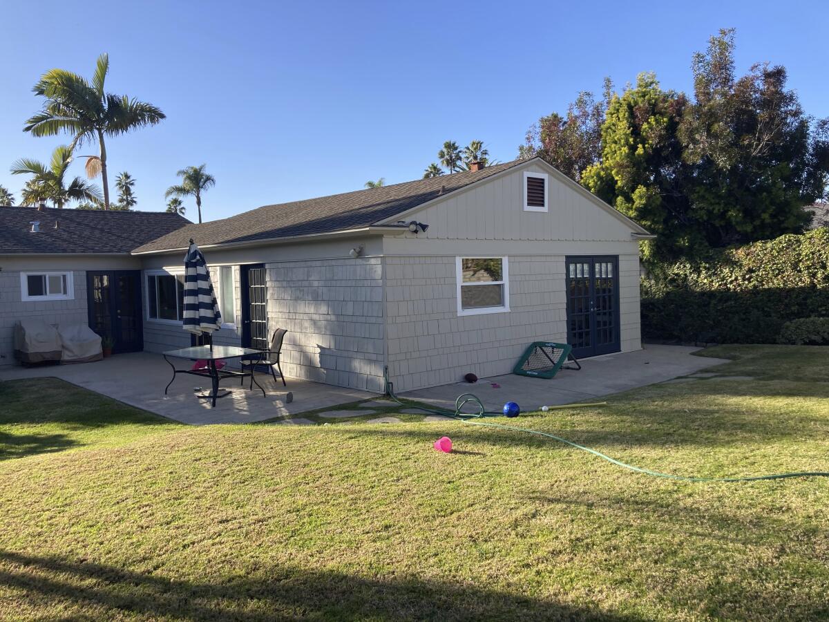
The original home’s small concrete patio and lawn in the backyard were replaced with a pool and outdoor living area.
(Christian Rice)
- Integrated indoor-outdoor living
- Both downstairs formal living and upstairs informal living spaces
- An oversized breakfast nook that could host family meals and provide study space
- Maximized ocean views of Windansea
According to Rice, the renovation began in late 2021 and was finished about a year later, during which time the family was able to rent a house a couple of doors down the street. The project, he said, involved a renovation to all of the existing area, including a 111-square-foot addition to the first floor and a new 1,970-square-foot second floor, plus a new roof deck. It now has five bedrooms, a little office for Patricia on the first floor, and 5½ bathrooms. Four of the bedrooms and bathrooms are upstairs, along with a comfy family room. The first floor has bright, voluminous spaces that are perfect for Patricia to host large networking events for work.
Rice mostly kept the L-shaped footprint of the original house, which helped the couple avoid the costly and time-consuming process of a full coastal review. But, said Rice, the addition of the new second floor necessitated a totally new structure design.
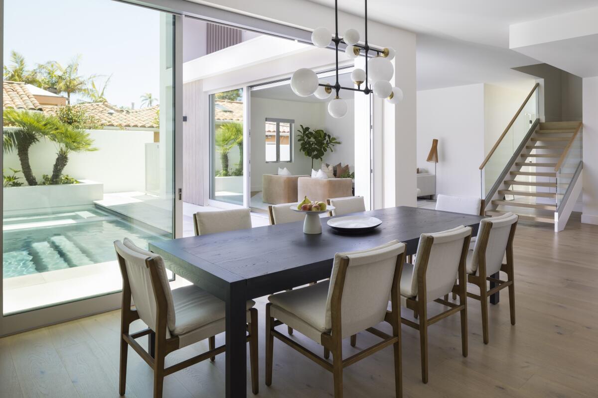
A sleek, charcoal-stained dining table provides seating for 10 in the dining area, which overlooks the pool.
(Nader Essa)
The design he created for the family couldn’t be further from the original brick and wood home. From the street, it has a strong contemporary aesthetic with plenty of glass and far-reaching vertical lines topped by a flat roofline and mixed materials palette.
“The exterior design incorporates a mix of Trespa composite wood siding, Geolam wood-hybrid louvers, stucco, anodized aluminum doors and windows, various aluminum and cementitious trim panels, and stone tile accents,” said Rice. “While the home has a very simple massing with the stacked front facade and flat roof, the exterior materials really bring the home to life and infuse a great sense of warmth and style into the design.”
The warren of little rooms and low ceilings inside is gone. The public spaces downstairs are open and airy, thanks to large windows and door openings, as well as high ceilings. The second story now gives the family the ocean views they craved, as does a third-story deck. There are plenty of spaces for the family to gather but also to give teenagers places to hang with their friends, whether down by the new pool and outdoor dining area, in the second-floor family room, or on the deck at the top.
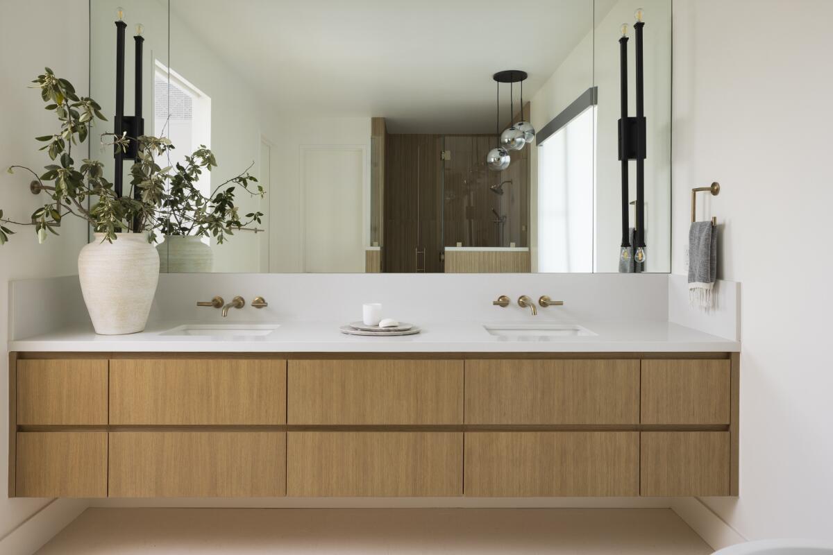
The design indoors was kept neutral with natural accents for a classic look that won’t become outdated.
(Nader Essa)
Interior designer Alicia Jonik of South Harlow married Rice’s architectural design with furnishings that met the Holmans’ lifestyle.
“South Harlow was a pivotal team member for the project,” Rice said. “They were involved in early design meetings. Owner Erika Gervin and her team took our basic interior elevation drawings and added details and materials to refine them further to bring the owners’ vision to life.”
It was important to Jonik to keep the larger pieces in the house neutral, starting with the Provenza Tresor Rondo engineered white oak flooring through most of the house, and then add in color from the outside, or an accent piece or piece of art.
“That keeps the design really timeless and then you can grow and evolve with it,” she explained.
She kept the materials durable for the young family, which now also includes a dog they’re fostering.
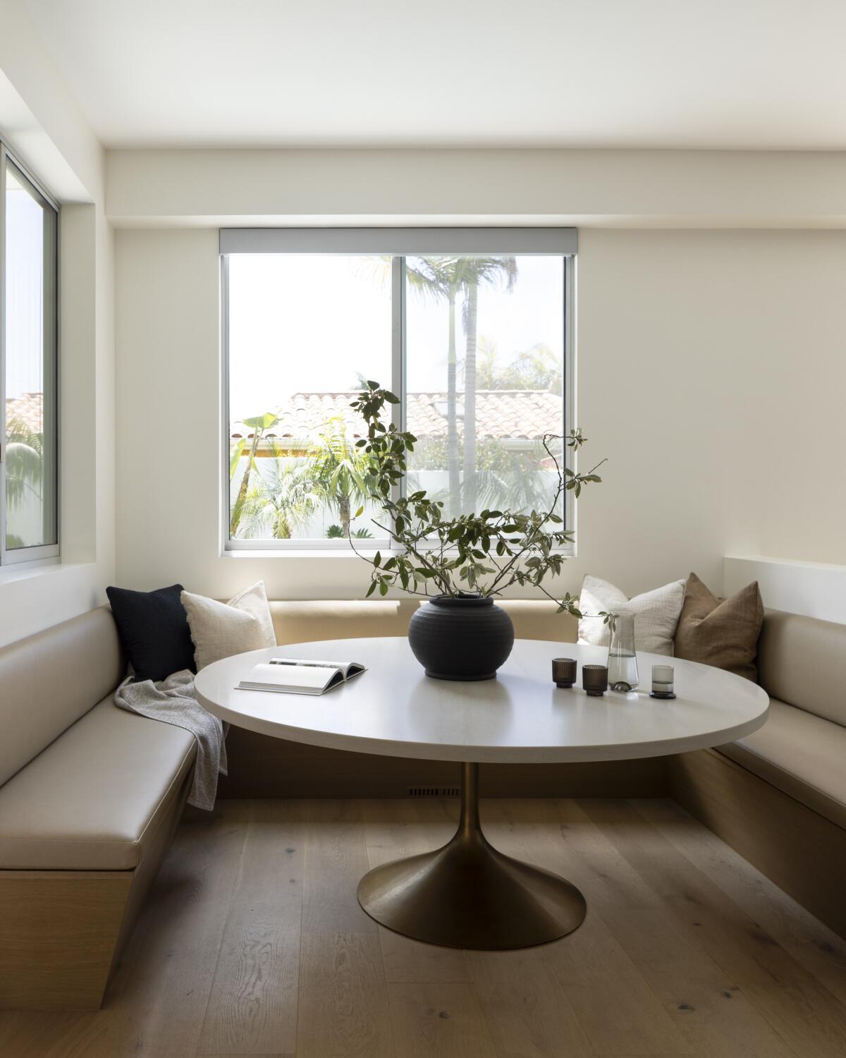
The large banquette was a must for the Holmans, who wanted a space for the family to eat together with plenty of room for friends. The benches are made of a durable vinyl that has the look of leather.
(Nader Essa)
“So, we chose a lot of indoor/outdoor fabrics,” Jonik said. “For the banquette where they eat, that’s a vinyl that looks like leather and it wears really nicely. The kids can beat it up if they want to. So just being cognizant of things like that I think is helpful to achieve the look but then also, more importantly, the function.”
That banquette is a feature the Holmans are passionate about. They wanted a huge seating space for the family to eat meals together, for the children to do homework on, and for them to host their friends. Holman pointed out that the 79-inch by 69.5-inch Luna Leather quartzite tabletop from Amazon Stones and the banquette, made by Andrew Morgan, was able to seat 16 girls on their daughter’s sports team.
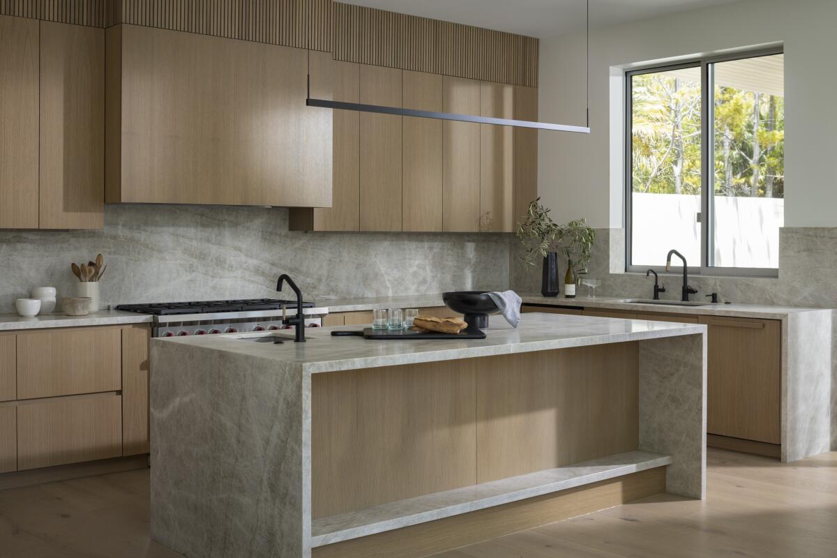
Plenty of storage space in the kitchen’s rift white oak cabinets keeps the counters uncluttered; a large kitchen island offers even more room to spread out.
(Nader Essa)
Jonik designed lots of storage space in the kitchen, including an appliance garage on one end of the back counter because, as Holman said, “we don’t really want any appliances on the counter at all.” They did put their Wolf toaster oven on the counter, but the rest of the space is devoid of clutter. The rift white oak cabinets extend across the length of the kitchen, topped at the ceiling by reeded oak panels, and include panels over the hood, the SubZero refrigerator, and Miele dishwasher. The kitchen also includes a 48-inch Wolf range. It’s opposite the spacious island — more than 8 feet long, with a linear suspension light from Visual Comfort above. The countertops are Brazilian Taj Mahal quartzite from Arizona Tile.
Just beyond the kitchen is the outdoor dining and entertaining area.
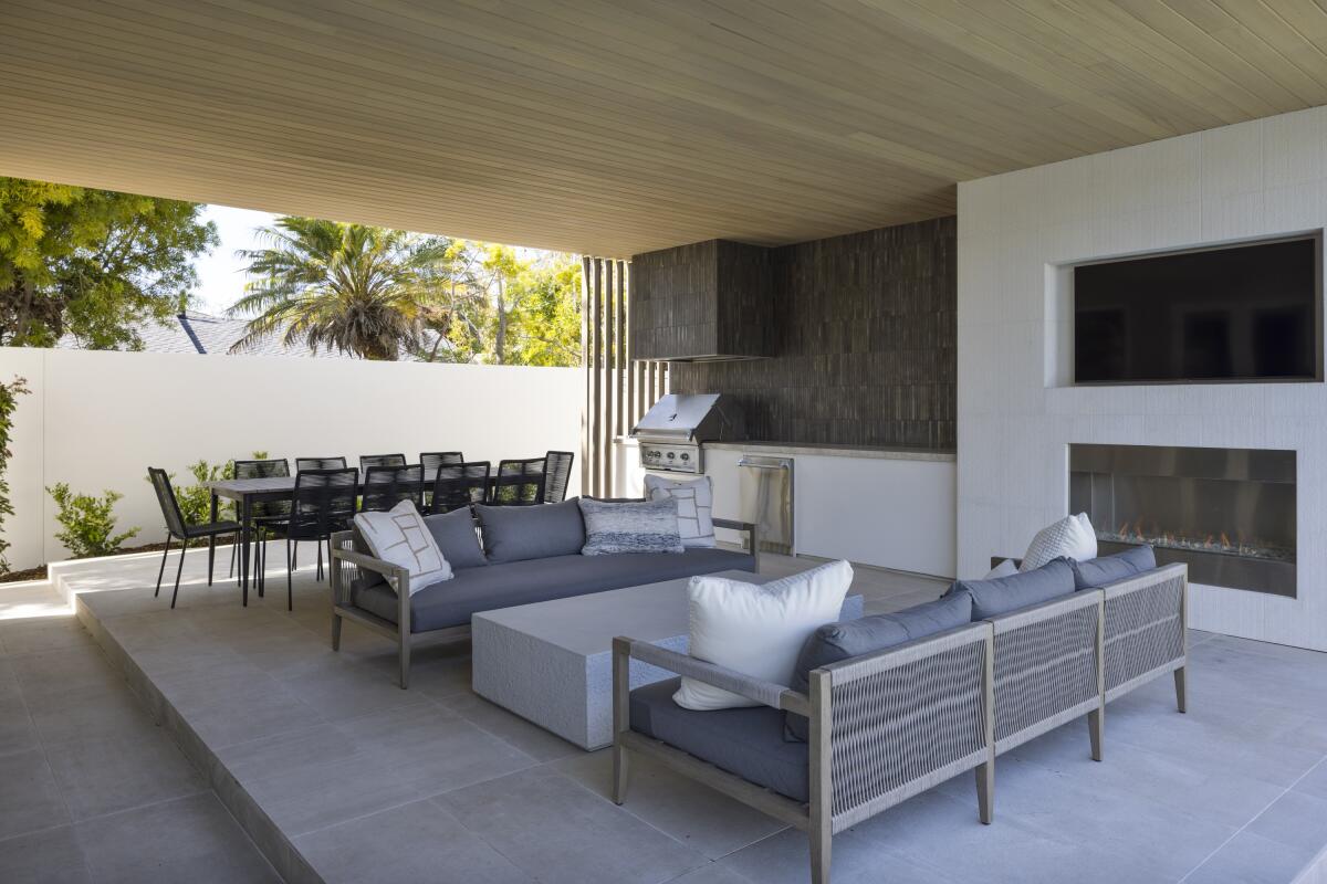
The backsplash of the outdoor grill area is dark to contrast with the house, as are the charcoal sofas.
(Nader Essa)
“Our main goal is taking what’s happening on the inside and making sure that it carries and translates well to the exterior. So, we picked materials that would highlight the architecture Christian designed,” said Jonik. “We used the same countertop material that we did in the kitchen. And then we picked that really beautiful, raked limestone to go on the fireplace because it was simple and quiet, but the texture is really nice and gives some dimension out there. And the tile that we chose for the backsplash of the grill area is dark because it just felt like nice juxtaposition with the house. And I like that it’s kind of like a semi-gloss, so you get a little bit of the shine.”
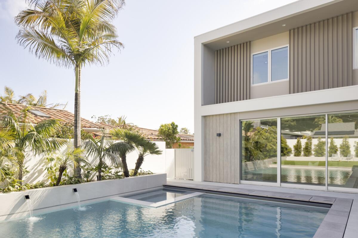
The pool is just big enough for the family to play a water polo game or hang out in the spa.
(Nader Essa)
Jonik extended the dark theme to the furnishings, including two charcoal Sherwood outdoor sofas on either side of a massive concrete Otero rectangular coffee table — all from Four Hands, a Wyton outdoor dining table also from Four Hands, and 10 Zina dining chairs from Article. Beyond is a small play area with artificial turf that abuts a pool large enough for the kids to play a game of water polo and enjoy a little spa time after. The expanse of the pool makes up the view from the rest of the kitchen and dining area.
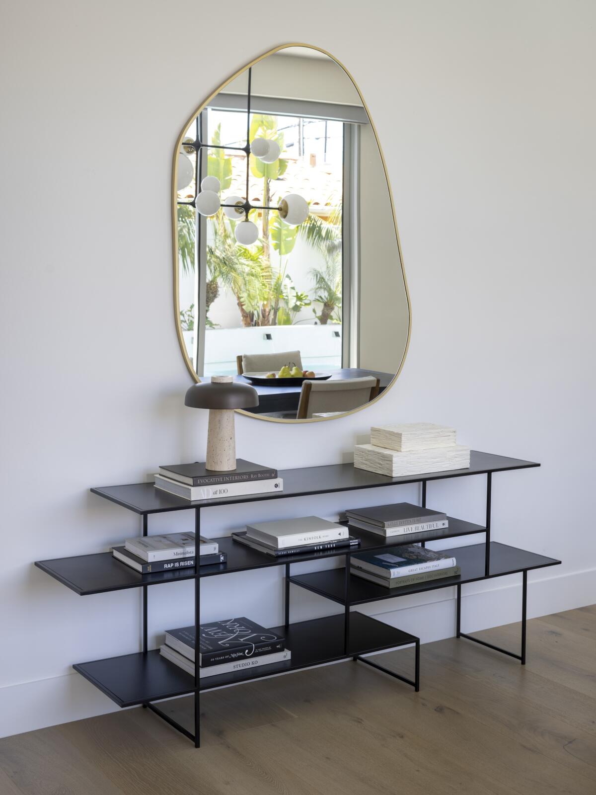
In the dining area, a console from Noir houses a mushroom-shaped table lamp, and a brassy mirror hangs above it all.
(Nader Essa)
There, Jonik kept the look sleek and simple. She selected a Walsh table in ash with a charcoal stain to seat 10 with Aya dining chairs from Four Hands. Against the wall is a black steel Metro console from Noir accented with a little mushroom-like Rohe table lamp of walnut and polished nickel from CB2. Above is a brassy gold Organik Mirror by Irregular Mirrors Collection from Ethnik Living.

A spacious sectional provides seating in the living room, where cabinets conceal the TV over the fireplace.
(Nader Essa)
The dining room flows around the L-shape of the house to the living room, which is grounded by a custom wool rug cut to 18.5 feet by 15 feet. On it rests a custom ebony coffee table 5 feet long, created by Eric Ruby at Redefined Woodworking. It’s surrounded by a spacious sectional from Room & Board with two Matra camel velvet lounge chairs from CB2 across from it. In the corner, Jonik designed a fireplace featuring the same Taj Mahal slab and riff white oak as the kitchen, with two doors that reveal the television.

Large windows provide light and ocean views in the second-floor living room.
(Nader Essa)
The Holmans have found their new home lives well for them. Their favorite elements are the breakfast nook and the unexpected delight of picking up surf lineup views from both the upstairs living room and the roof deck. But that’s just part of what they’ve gained.
“Work events, kids’ pool parties, grilling at least weekly,” said Holman, “the feeling of airy space and sunlight everywhere gives a sense of peace in the house. Plus, no one has to share a bathroom with our fourth-grade son anymore!”
Golden is a San Diego freelance writer and blogger.


