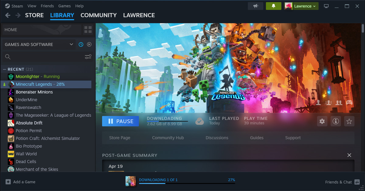
In April, Valve revealed it was overhauling Steam in a big way — not just a fresh coat of paint, but also unifying the codebase between its Desktop, Big Picture Mode and Steam Deck interfaces, adding new features like a handy cloud notepad and pinnable panels in the in-game overlay, revamping its web browser, screenshot manager and notifications tabs, and adding hardware acceleration for Linux and Mac.
While much of that has been available in beta, today’s the day it goes wide with a full stable release. So if your Steam is looking rather different, that’s why!
And reader, my gaming colleagues and I have been impressed by how much we like that coat of paint. Older changes to the Store and Library tabs notwithstanding, Steam has looked like an ancient application for a very long time, and now it’s… nice! “I finally like Steam,” my colleague Tom Warren confided.
Me, I’m still most excited for the cloud notepad, which I can confirm also now works on Steam Deck — though it doesn’t look like you can use it as a translucent in-game overlay like you can on desktop just yet. You can find it from inside a game by hitting your Steam button, then scrolling down to Notes.


